
fNIRS analysis toolbox series – NIRSTORM
Introduction
Here we present NIRSTORM, a NIRS analysis plugin for the MATLAB-based MEEG Brainstorm toolbox. It is aimed at researchers with a background in neuroscience, engineering, optics and physics. Here, we present the basic principle of NIRSTORM and show a simple example of how to go from raw data to a visualization of the average response over trials and sessions.
This blog post is part 3 of the fNIRS analysis toolbox series.
About NIRSTORM
The main developers are from different groups in Montreal, Paris and Chemnitz. The main developers are Thomas Vincent, Zhengchen Cai, Edouard Delaire, Robert Stojan and Alexis Machado. Collaborators are Amanda Spilkin, Jean-Marc Lina, Christophe Grova and Louis Bherer.
- Core purpose and core strength of the toolbox
The main features of NIRSTORM are classical within-subject analysis including motion-correction, conversion of change in optical densities to change in oxy- and deoxyhemoglobin concentration and window-averaging. NIRSTORM also allows the user to compute advanced processing like the optimal montage to determine the montage maximizing its sensitivity over a region of interest or Maximum Entropy on the Mean for source reconstruction. All this can be done within a graphical user interface, and scripts can be generated to simplify batch-processing. Finally, database organization makes the exploration of the different signals easy, and simplifies the organisation of study regrouping data coming from multiple modalities (eg MRI, EEG, MEG, NIRS).
The main papers for this toolbox are the Brainstorm paper and the NIRSTORM plugin as mentioned in the fNIRS 2018 biennial symposium.
Implementing the processing pipeline in NIRSTORM

Figure 1 shows an overview of the different elements of the NIRSTORM user interface referred to throughout this blog post. The main window is the persistent part of the GUI that you are presented with when starting up brainstorm and through which most of the processing is handled. Additional windows, like the time-series and 3D-viewers are opened through the main window to handle specific tasks like visualising the data and marking bad segments.

Figure 1. Overview of the different components of the NIRSTORM graphical user interface.
Creating a project and loading data
NIRSTORM organises data into protocols, created through File > New Protocol. Each protocol contains subjects, created through File > New subject. Each subject can have one or multiple data files, these are loaded in the functional view by right-clicking the subject and selecting Review raw file. Files can be loaded as single files or as a whole folder structure containing data files. Figure 2 shows the functional view of the data panel with data file from three separate sessions of fingertapping for Subject01 in the Blog protocol.

Figure 2. Data panel in functional view mode with three raw data files loaded for Subject01
Manual rejection of trials
Double-clicking a raw file link in the data panel opens up the time-series viewer (Figure 3). Data can be displayed in “butterfly” mode where channels are overlaid on top of eachother, or in column mode where channels are vertically separated. Horizontal lines indicate experimental events (press CTRL+L to cycle through event display modes), green lines represent the onset of finger tapping trials and the orange lines mark rest period onset.
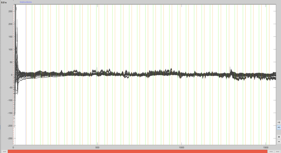
Figure 3. Data displayed in the time-series viewer in butterfly view mode
Trial rejection is performed by marking the unwanted segments as bad through the time-series viewer (click-and-drag with mouse, press B). Any trial containing a bad segment is then excluded in further analyses. Channels can also be discarded by selecting the channel and pressing Delete, this is useful if e.g. a channel has bad scalp coupling and has a consistently bad signal throughout the whole recording
To effectively identify artefacts it is necessary to get a closer look at the data. Zooming can be performed using the zoom functions of the time-series viewer. An example of a large movement artefact can be seen in Figure 4 in the red channel. After marking a segment as bad it shows with a red background in the time-series viewer and the text BAD appears above the segment. See these links for information related to trial rejection (1, 2, 3, & 4).
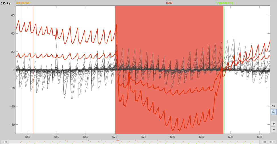
Figure 4. A zoomed in view of the data displaying a large movement artefact that has been marked as bad.
MBLL - Conversion from intensity to hemoglobin concentration changes
Processing of data in NIRSTORM is done by dragging data to the processing panel, clicking the RUN button, and then selecting the processing step to be performed from the pipeline editor.
Calculating concentration changes is performed in a single processing step in NIRSTORM, NIRS > dOD and MBLL > MBLL - raw to delta HbO. This computes changes in oxy-, deoxy and total hemoglobin from the raw optical data.

Figure 5. Concentration changes calculation process and options.
Going into the details about the computations is outside the scope of this blog, but you can read up on this with these articles (Wikipedia, Duncan-1996, Scholkmann-2013)
Low-pass filtering 0.1Hz
Filtering of the data is done though NIRS > Pre-process > Band-pass filter. Here we apply a 3rd order lowpass Butterworth filter, with a cutoff of 0.1Hz. Figure 6 shows the data pre and post filtering. After filtering, the heartbeat is barely visible (lower panel).
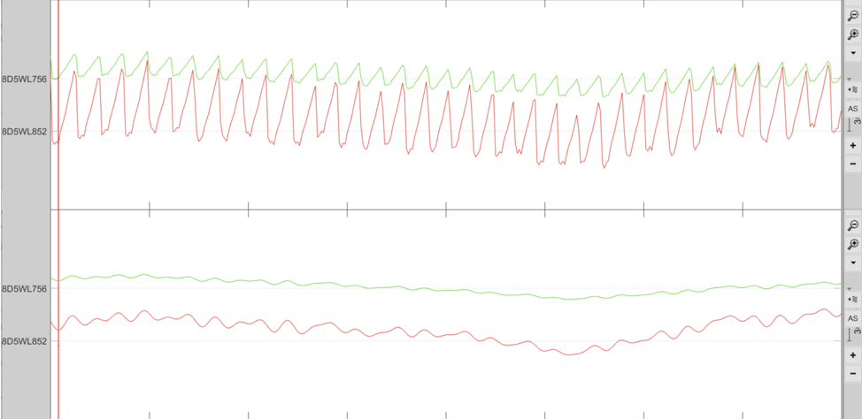
Figure 6. View of the data pre (top panel) and post-filtering (bottom panel)
Averaging of trials
With the data transformed to oxy- and deoxyhemoglobin changes the data it can be split into trials and an average response to fingertapping across all trials calculated. This is done by first importing the data into the database (right-click, select Import). When importing, epochs can be made per event, and each epoch baseline can be corrected based on an adjustable time-period preceding trial onset (Figure 7).

FIgure 7. Import in database function showing epoching and baseline functions.
Completing the import creates a folder containing 30 files, one for each fingertapping trial. The average (mean) and a measure of dispersion (in this case SEM) over all trials can then be computed by running Average > Average files on this folder. This results in a new file named after the averaging method, in this case AvgStderr.
Plotting trial average
There are many ways to visualise the trial average data for multiple channels simultaneously, two examples can be seen in Figure 8. As time-series (right-click, select NIRS > Display time series) in butterfly mode (a), or as 2D layout (right-click, select NIRS > 2D Layout) corresponding to the optode template (b). From these plots a single channel can then be selected and displayed in its own plot, e.g. Rx7-Tx10, which shows a nice response (figure 9).

Figure 8. Plots of average over trials. A. Butterfly plot of channels with SEM (shaded region), B. 2D layout plot . Red lines represent oxyhemoglobin, blue deoxyhemoglobin, and green total hemoglobin.
From these plots you can select channels of interest, e.g. Rx7-Tx10, which shows a nice canonical hemodynamic response (Figure 9).

Figure 9. Mean response, and standard error, over trials for channel Rx7-Tx10 (S10D7).
Averaging across sessions is easy in NIRSTORM as all the preprocessing steps can be performed on multiple files in parallel. After calculating the average over the trials per session, and then averaging over sessions, the grand average can be visualised in the same way as the session average. For channel Rx7-Tx10 we see that the grand average looks very similar to the session average we saw earlier (Figure 10).

Figure 10. The grand average over all three sessions of fingertapping
3D digitization is possible as well, for the Brite23 a comparative example is shown below in FIgure 11.

Figure 11: left original fig of Brite23 optode template in Oxysoft, right the same template in NIRSTORM.
Two unique features of NIRSTORM are the computation of optode montage that optimize the sensitivity to a given cortical region of interest (Machado et al., 2018), as can be seen in Figure 12, and source reconstruction. These two features can be used on the subject specific anatomy or using pre-computed fluences based on Colin27 template [REF]. Furthermore, an optode template sensitivity analysis can be performed based on a transmitter-receiver combination, as can be seen in video 1.

Figure 12: Computation of the optimal transmitter-receiver placements for maximum sensitivity for a given brain region.

Figure 13: This GIF shows the total sensitivity profile of the optode template (top) and the sensitivity map of each transmitter-receiver-combination (bottom).
Conclusion
This was a brief overview of what running a basic processing pipeline looks like in NIRSTORM.
NIRSTORM makes it easy to organise your data, projects are stored in a database and can be quickly loaded by a single click. Within each project it is easy to get an overview of subjects, sessions, conditions, and analyses thanks to the hierarchical folder organisation. Further, for each processing step, the original data are retained and the results are automatically given descriptive names. This makes it very easy to keep track of what has been done and back-track if needed.
Overall we think NIRSTORM is a great option for those who want to run analyses without having to do any coding, while still having the option of using more advanced features like source reconstruction and analysing the sensitivity of an optode template.
To get some inspiration and see what has been done previously, check out these three studies (1,2,3) that used NIRSTORM in their analysis of NIRS data.
Further reading and links
Wiki | Installation instruction | Tutorials | Brainstorm Tutorials | Development roadmap