
UX Design for Brite Connect Ultra: Making Large-Scale Hyperscanning Truly Scalable
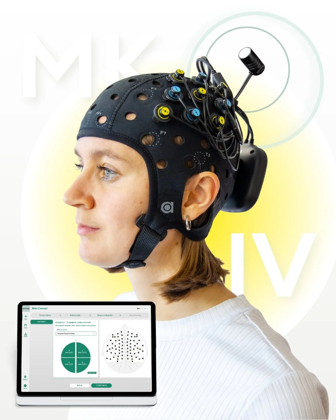
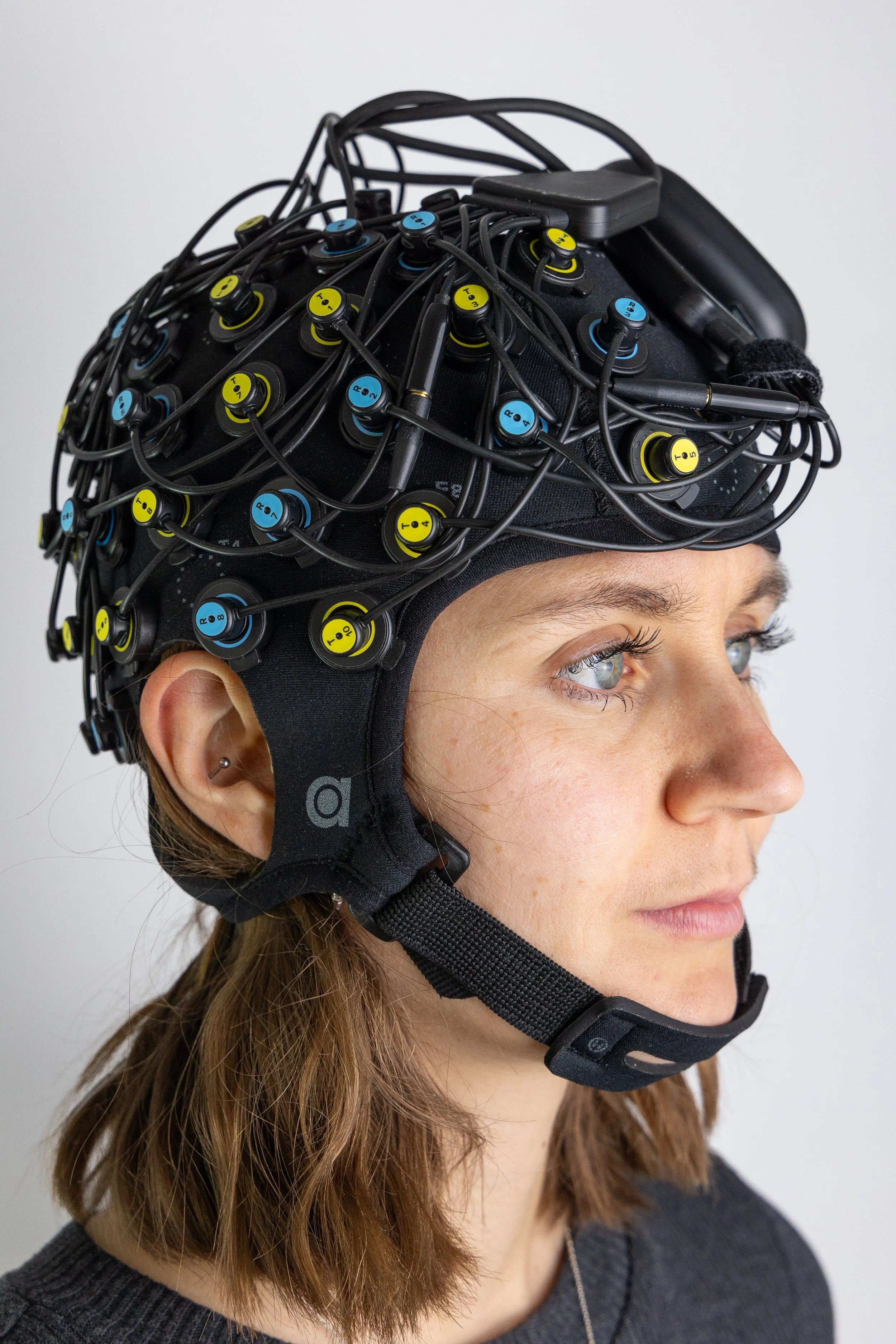
At Artinis, we are continuously looking for ways to improve and expand our research solutions. With our best-selling product, Brite, researchers were already able to conduct hyperscanning experiments on a smaller scale. However, when scaling up, a clear friction point emerged in the workflow.
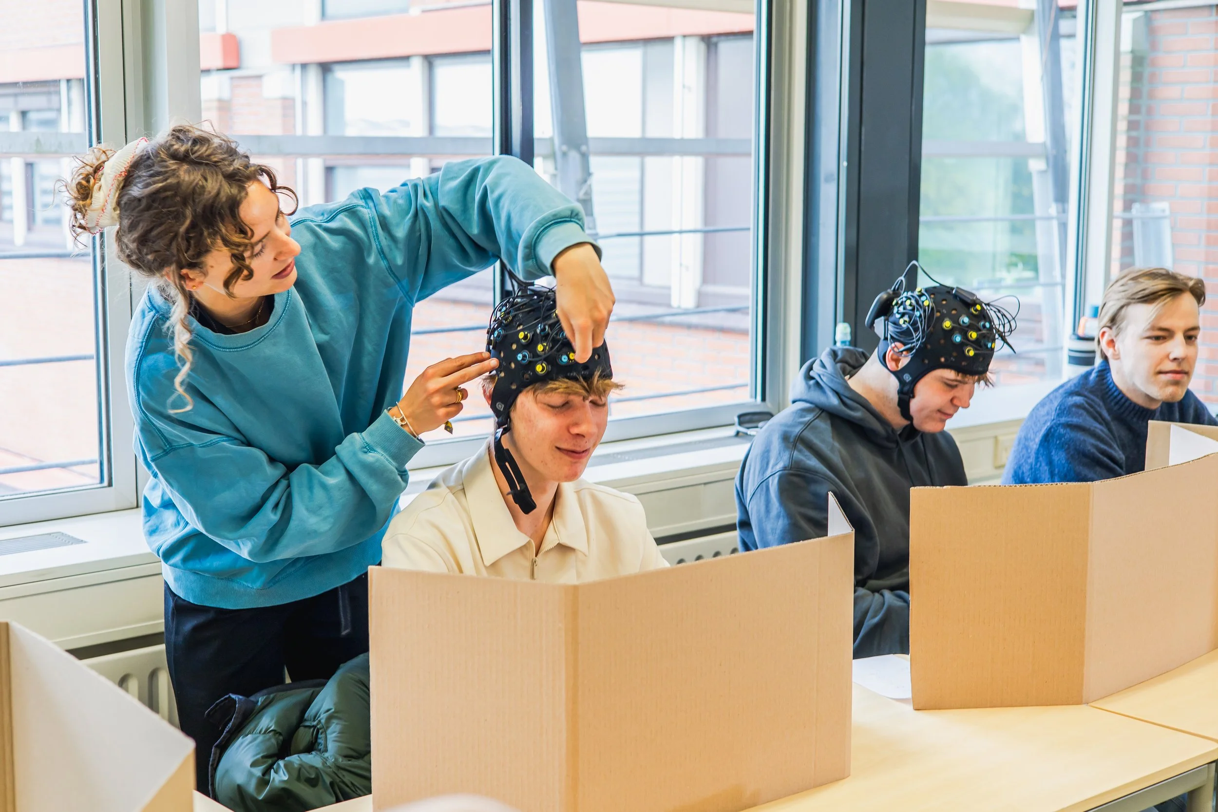
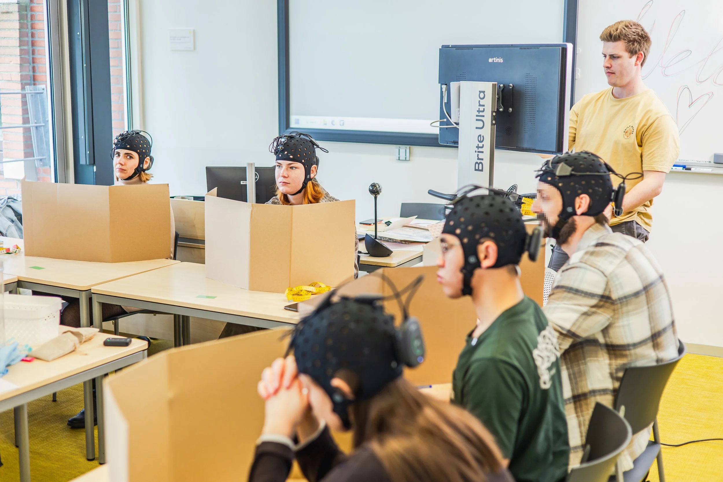
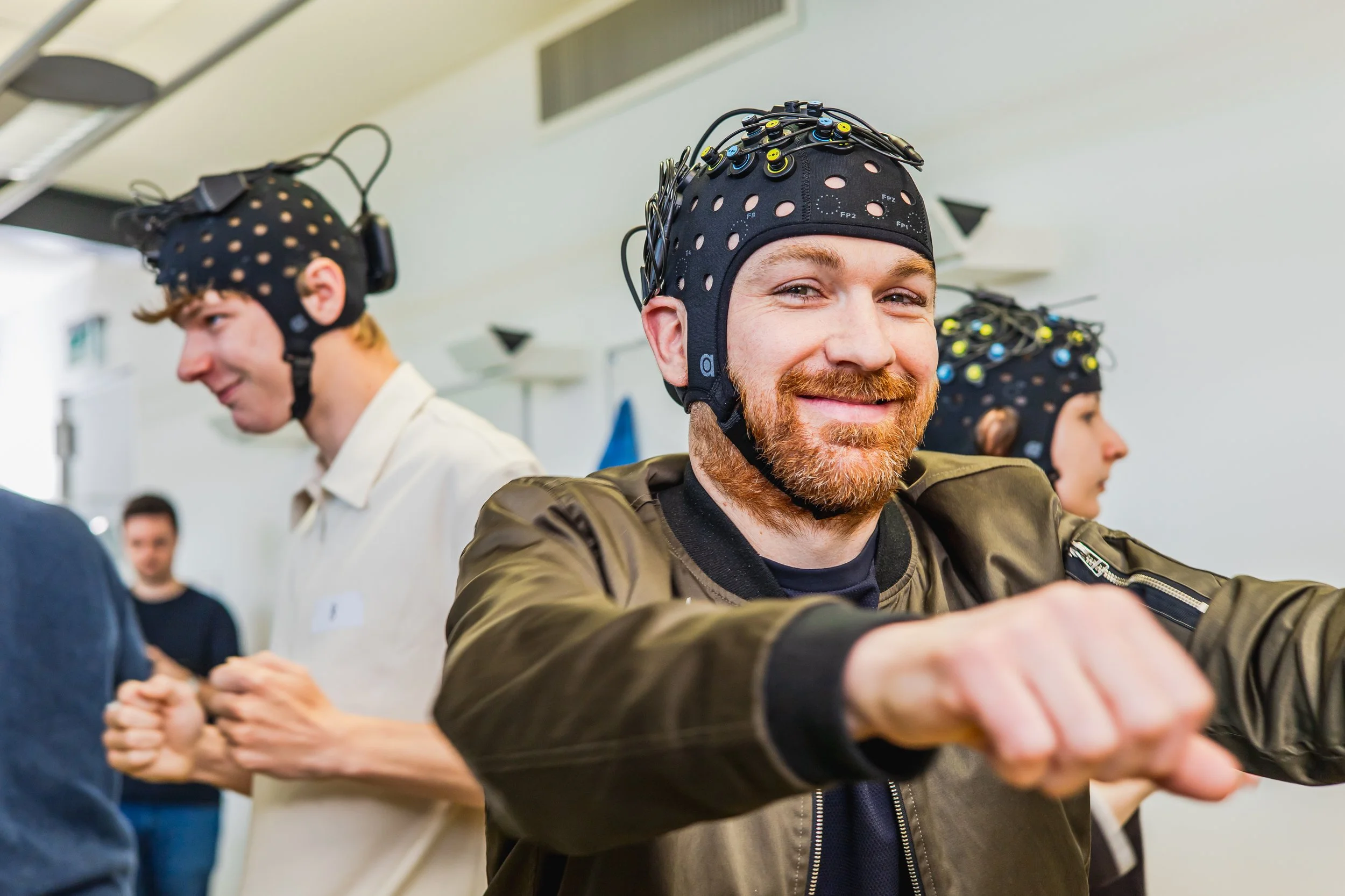
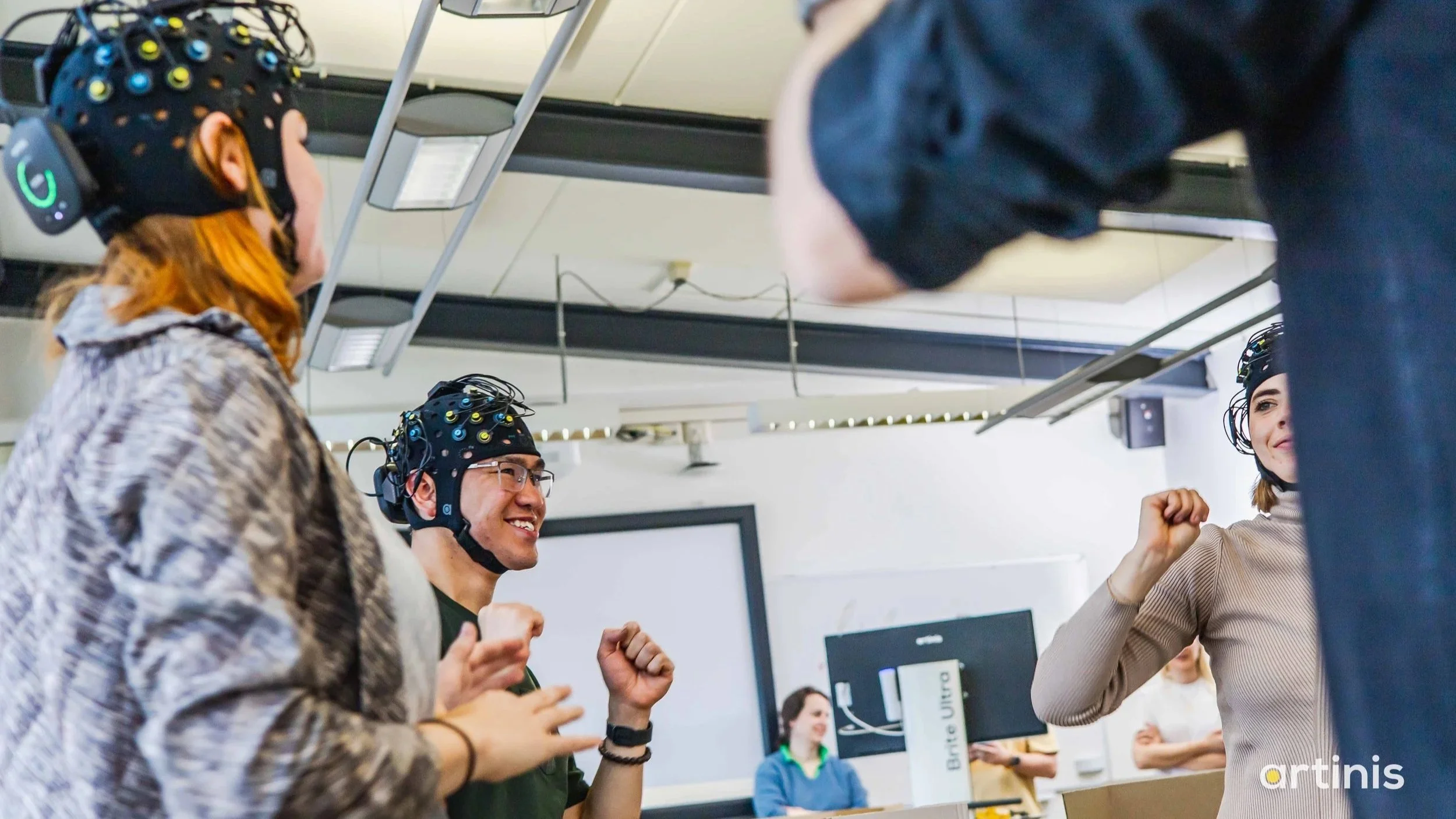
Measuring 30 participants meant using 30 devices, and therefore 15 laptops. While not a small feat, this has been done by some impressive teams around the world (Brainstorming: Interbrain coupling in groups forms the basis of group creativity | List of publications using Artinis Near Infrared Spectroscopy devices). However, monitoring that many screens and data streams scattered across a lab didn’t just create logistical challenges; it increased cognitive load, reduced efficiency, and introduced unnecessary complexity into already demanding experiments.
At Artinis, our mission is simple: make imaging easy so researchers can focus on what matters, their research. Large-scale hyperscanning presented a clear challenge. We answered it the same way we always do: by removing the complexity and making it accessible.
The UX Challenge: Designing for Scale Without Overwhelm
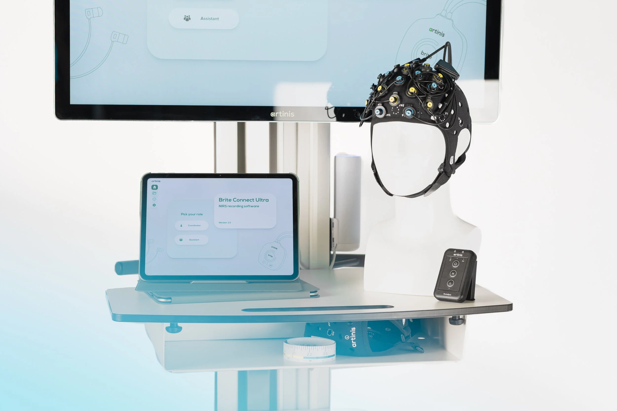
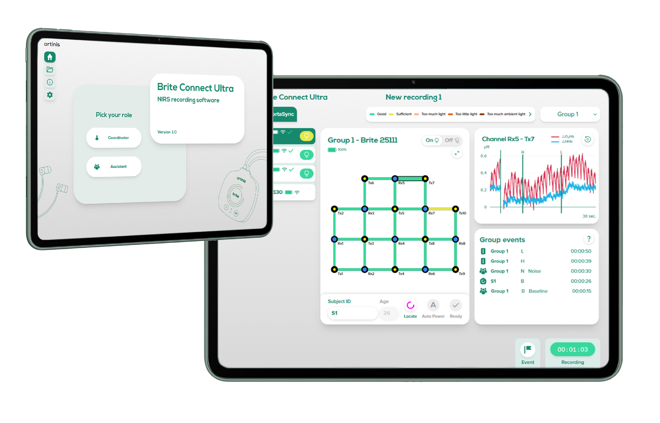
The vision behind Brite Connect Ultra was ambitious: Create a single software environment capable of connecting and monitoring up to 30 Brite devices and their data streams simultaneously, all from one hub.
But coordinating 30 real-time fNIRS data streams is inherently complex. Each Brite can measure up to 27 channels, resulting in a total of 810 (!)(27x30) graphs that the user needs to monitor. From a UX perspective, the challenge wasn’t just technical — it was largely cognitive.
We identified three core design challenges:
1. Scale
How do you visualize 30 Brite devices, with 27 channels each, without overwhelming the user?
2. Complexity
How do you translate highly technical signal data into something glanceable and actionable?
3. Collaboration
How do you support teams working together in the same experiment without creating control conflicts?
Designing for Clarity in a High-Density Interface
Rather than designing a traditional control panel filled with data and buttons, we focused on structuring the entire system around how researchers think and work during live experiments. We didn’t just design an interface; we designed a structure that makes managing 30 live devices feel organized and manageable.

A Dashboard Built for Glanceability
Managing 30 devices requires a structure that allows researchers to:
Instantly see subject status
Monitor signal quality
Identify connection issues
Detect outliers in real time
We designed a scalable dashboard system where each subject is represented with clear visual indicators. Strong visual hierarchy and consistent status cues reduce the need to scan detailed data constantly. The goal was to allow researchers to feel in control at a glance. Instead of forcing users to interpret dense signal data across multiple screens, the interface surfaces only what matters most, in real time.
Designing for Collaboration, Not Just Control
Large-scale experiments are rarely managed by one person. Hyperscanning studies often involve a research coordinator and multiple assistants working simultaneously.
To support this, we introduced a role-based interface structure.
Coordinator view – Full system oversight, global monitoring, and high-level control.
Assistant view – Focused controls relevant to individual participants or subsets of devices.
By separating responsibilities within the interface:
We reduce the risk of accidental errors.
We minimize interface clutter for each role.
We improve team efficiency during live experiments.
Instead of one overwhelming interface, each user sees only what they need. This dramatically lowers cognitive load and improves confidence under pressure.
Real-Time Feedback for Confident Decision-Making
Because large-scale hyperscanning requires careful preparation, the interface was designed to provide clear feedback during setup. This allows researchers to validate connections and signal quality in advance, ensuring a smooth and reliable experiment.
The system was designed around:
Clear real-time status indicators
Immediate visual alerts
Structured layout for fast scanning
Consistent interaction patterns
This ensures that issues are identified early and resolved before they compromise an experiment.
The Result
Complexity Made Manageable
The final design transformed Brite Connect Ultra from a potentially intimidating technical system into a structured, user-friendly hyperscanning hub.
Researchers can now:
Monitor up to 30 device statuses and their data streams from a single screen
Collaborate seamlessly within defined roles
Maintain oversight without information overload
Conduct experiments that were previously difficult to manage
By simplifying complexity rather than hiding it, the interface builds trust. Teams can focus on research instead of infrastructure.
UX as a Strategic Enabler
Brite Connect Ultra demonstrates something fundamental about UX in advanced research technology:
Good UX isn’t only about what happens on the screen, and it’s not just about making software look better. It’s about designing systems that guide users towards what they need to do, helping them understand complex information at a glance, and act with confidence.
In large-scale study designs with many participants, UX must support decision-making, not slow it down. By designing for scale, clarity, and collaboration, we transformed a technically complex workflow into an intuitive system that helps teams stay focused on their objectives instead of getting distracted by the interface.
When UX is done right, the software doesn’t just function — it actively supports the work, making advanced research feel manageable, efficient, and purposeful.
And that’s exactly what innovation should feel like — not overwhelming but enabling.
Mass fNIRS hyperscanning
—made easy.


At Artinis, our mission is simple: make imaging easy, so researchers can focus on what matters, their research. Large-scale hyperscanning presented a clear challenge. We answered it the same way we always do: by removing the complexity and making it accessible.